 The majority of internet users today have gone mobile. Based on research by Statcounter, 56.94% of internet traffic comes from mobile\tablet devices. That’s more than half of all internet users. Chances are, a large percentage of your visitors will be accessing your site from their mobile devices. Following these statistics, responsive mobile WordPress themes are not optional.
They are important! This is because having a responsive theme enables your visitors to access and utilize your site from their phones.
So in this article, we will explain:
- What a Mobile WordPress theme is
- Why it is important
- 10 best mobile friendly WordPress themes to use
- Conclusion
Let’s begin.
What Is A Mobile WordPress Theme?
A Mobile WordPress Theme is a theme that operates at full functionality on mobile devices. This means when a website is accessed from a mobile device, the website’s theme automatically adjusts its layouts and page elements to fit the screen size. So your site will equally look good on mobile devices and desktops.
Why Is It Important?
Gone are the times when a desktop was needed to access the internet. With a smartphone, users can visit and utilize any site they wish to, on the go. As a website owner, if your site’s theme isn’t mobile-friendly, you will essentially be cutting off a large number of your page views and site visits. Thus, this can have a negative impact on your business.
Clearly, having a mobile WordPress theme is important for your site’s success. Using a responsive theme not only gives your site a professional look but also improves the user experience.
What’s more, it improves your site’s SEO rankings and grows your website traffic. So with thousands of themes out there, you might find it hard to select a great Mobile theme. Thus, we have selected 10 of the best responsive WordPress themes to help you create mobile-friendly websites.
10 Best Mobile Friendly WordPress Themes
Divi
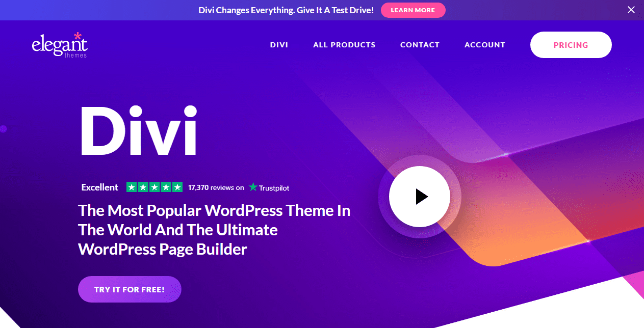
One of the most popular mobile WordPress themes and page builders, Divi, is a fully responsive theme. You get to choose from thousands of design options to create a beautiful website. Users can also create different types of websites with Divi’s ready-made layouts, website templates, and landing pages.
Divi is highly customizable, so you can design your website the way you want without writing a single code. This multipurpose WordPress theme makes building a website easy for even a beginner.
Its other features include:
- Responsive editing which allows you to control the look of your website on mobile devices
- Header and footer builder
- Shape dividers
- Application of background images and videos to elements
- Hover state styling
- Inline text editing
What’s more, Divi is WooCommerce compatible, so you can build and design your online store with ease.
Astra

Astra makes the list of our top 10 mobile WordPress themes. Built for speed, this theme provides you with pretty much all you need to get your website running. With one click, you can import from over 180 starter templates and create a beautiful website in minutes.
Astra also provides you with a visual theme customizer with different design options to customize your website easily. Other features of this theme include:
- Gutenberg compatibility
- WooCommerce compatibility
- SEO optimization
- Google fonts and Custom fonts
- Responsive font size
- Translation and RTL ready
- Lightweight structure
In addition to these, Astra offers advanced styling options like the Header Footer builder. You also get to see your designs as you build with its live editing feature. Safe to say, it is one fully responsive theme worth going for.
OceanWP

OceanWP prides itself on being a versatile, multipurpose theme. It can serve as a portfolio theme, blogging theme, travel theme, and more. With its many unique features, you can easily customize your site. This theme is fully responsive. It also provides you three different mobile menu styles to select from.
OceanWP can be used to create an eCommerce website as it has WooCommerce integration to boost conversion rates. These are its other features:
-
- A responsive layout
- Customizable header styles
- Global fonts and typography
- SEO friendly
- RTL and Translation ready
- Elementor page builder
Hestia

A product of Themeisle, Hestia is a responsive one-page theme with features that make creating a website easy. It comes with a live customizer, which means you get to see changes you make on your website in real time.
With this theme, you can add a multi-column drop-down layout to your top menu with its responsive mega menu feature. The Hestia theme is compatible with popular page builder plugins like Elementor, Beaver Builder, Visual Composer, Divi Builder, etc… Other features include:
- Fast loading time
- SEO friendly
- Homepage sections for pricing and portfolio
- Translation and RTL ready
- Has WooCommerce integration
- Starter sites
- Slick material design
What’s more, Hestia theme is compatible with popular WordPress plugins and provides support and 1-click updates.
Neve Mobile WordPress Theme

Another product of Themeisle, Neve is a lightweight theme with a load time of 0.6 seconds. Neve comes with over 80 starter sites you can import with just one click. Also, you can design your header and footer easily with its drag and drop feature.
This fully responsive theme renders your site as native Accelerated Mobile Pages. This feature makes your site super fast on mobile devices. Neve theme is:
- Easy to setup and has sleek designs
- Fast and lightweight
- Flexible and easy to use
- Compatible with popular page builders
- Fully customizable
Neve is a multipurpose theme suitable for freelancers, small businesses, or hobbyists.
Ultra

Loved by developers and designers, Ultra is one of the mobile WordPress themes that comes with a built-in drag and drop page builder. This feature makes it easy to copy and paste elements on your site without writing a single code.
This theme comes with smart layout options, enabling you to create different looks for each website page. It also provides users with ready made demo content that they can import with just one click.
Ultra also comes with a lot of styling options to help you create a beautiful website. Some of them are:
- 6 Header background options
- 17 Header/Page styles
- Over 60 pre-designed layouts
- Parallax scrolling
- Sticky header
- Slider backgrounds
Authority Pro Mobile WordPress Theme

If you’re a business coach or an influencer and need to reach a wider audience, this WordPress theme is designed for you. Built on the Genesis framework, Authority Pro is a powerful and fully customizable theme by StudioPress.
Not only is this theme Gutenberg optimized, but it is also compatible with the HubSpot plugin. This plugin auto-generates a live chat, pop-ups, and a contact form suitable for the theme.
In addition, Authority Pro is eCommerce ready, so you can set up your store and sell products online. It is also easy to set up using the theme options panel. Other features include:
- Custom page templates
- Customizable header
- Mobile responsive
- Custom widgets
- WordPress block editor friendly
As for being secure, Authority Pro boasts of excellent security and is SEO optimized.
Side Note: StudioPress is now a part of WP Engine, the most popular managed WordPress hosting company.
Essence Pro

Designed for those in the health and wellness business, Essence Pro is a blogging theme with a simple and traditional design. This theme has a modern responsive design and displays perfectly on all devices. Just like Authority Pro, Essence Pro is powered by the Genesis Framework. Therefore, it is fully customizable and allows you to create a unique design.
Additionally, Essence Pro provides many customization options like custom header, 6 widgets areas, theme customizer, etc. This theme is optimized for the Gutenberg block editor and also allows users to create contact forms easily. Its other features are:
- Landing page templates
- Google fonts integration
- Accessibility ready
- AMP ready
- eCommerce friendly
- Layout options
Further, you can set up your theme quickly and easily with just one click.
Guten Theme
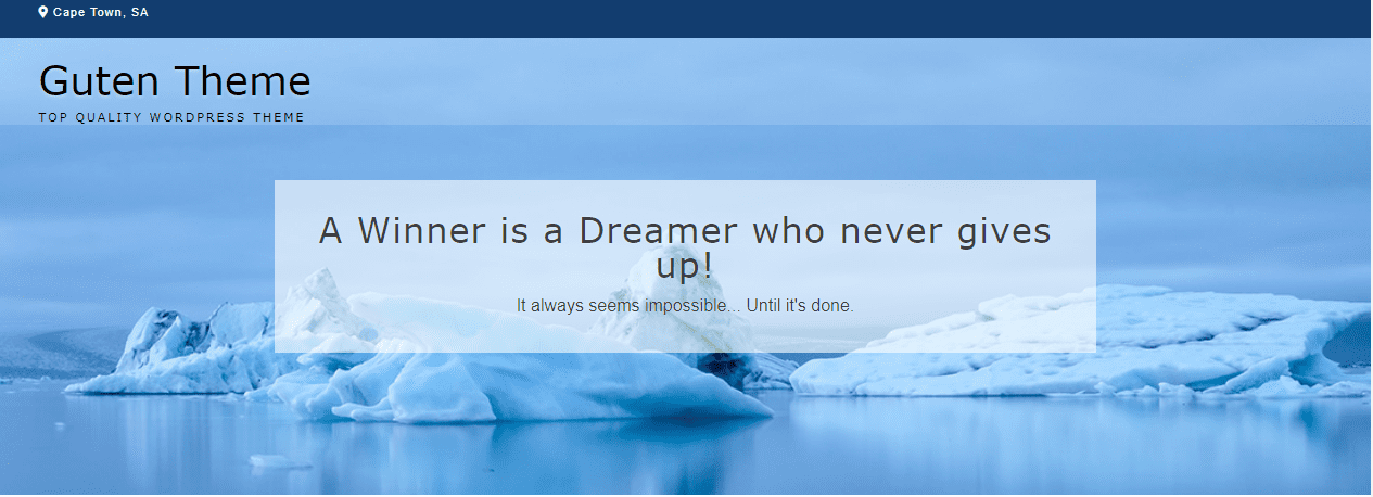
Guten theme is one of the most powerful mobile WordPress themes that integrates seamlessly with the Gutenberg block editor. This theme also works well with the Elementor page builder, so you can easily create any type of blog layout with its drag-and-drop interface.
More to these, this theme is WooCommerce ready, so you can turn your site into an online store. You do not need to worry about speed as Guten is fast and lightweight.
Here are some other features of this theme:
- Integration with popular page builders
- SEO optimization
- Fully responsive
- Translation ready
- Page builder layouts
- 10 Header layouts
Additionally, Guten theme comes with lots of customization options to help you build a professional site. You can fully customize your site with the WordPress customizer, without writing a single code.
Breakthrough Pro

Looking for a powerful WordPress theme to create a business website, this theme is for you. Due to its minimal design, Breakthrough Pro is suitable for advertising and marketing agencies.
This theme is built on the Genesis Framework, which makes it powerful and robust. It is also Gutenberg optimized, so you can create great-looking content for your site. Other features include:
- 9 Widget areas
- A portfolio section
- Custom header
- Multiple layout options
- Customizer support
- Theme options panel
- Mobile responsive
What’s more, Breakthrough Pro is WooCommerce ready and is designed with SEO-friendly coding standards so your site can have a good online ranking.
Conclusion – Mobile WordPress Themes
That’s it! 10 WordPress mobile themes for you to choose from. These themes offer great features for good website performance and more importantly, they display well on mobile devices.
Hopefully, you will be able to find a theme suitable for you. You can also go through our support pages for Enfold, Avada, and Divi themes for more WordPress theme help.
If you found this article helpful, please leave a comment below. And for more tutorials, please go through our WordPress blog.