How To Fix Media Query Not Working In WordPress
For easy access and readability, a site’s content must adjust itself to fit screens of all types and sizes. So one means by which web designers achieve this is by the use of a CSS technique called Media Query. While this technique helps to style a page based on the orientation (landscape or portrait) of a device or size of a screen, you may have issues getting media queries to work on your WP site.
If this is the case with you, you’ve got two options – try fixing it yourself or get an experienced WP expert to resolve it. The latter option is much better if you aren’t so comfortable working with codes or you just need extra time to focus on more productive issues.
At FixRunner, we understand the importance of creating a well-functioning website, and that’s why we’ve put together this guide to help you fix your media query issues in WordPress. Whether you’re a beginner or an experienced web developer, this article will provide you with the information you need to get your media queries working correctly.
Content:
- Definition and Usage of CSS Media Queries
- How Media Queries Look
- How To Fix Media Query Not Working
- Conclusion
Definition and Usage of CSS Media Queries
Firstly, we will take you through the structure of CSS Media queries. However, if you simply want to find out what to do when your media query does not work, skip to the related section below.
As we earlier mentioned, Media Query is a CSS (Cascading Style Sheets) technique used to customize the appearance (font size, color styles, etc) of a page’s content across different screen sizes and resolutions.
The primary goal of every website owner is to offer the best experience to everyone who visits the site. Desktop users must have a great user experience, so also iPhone and smartphone users.
So this is where a media query comes in. It essentially tells the browser what to do when a mobile device is used to view the page and what to do when a larger device is used.
This is a simple example of a media query:
@media screen and (max-width: 480px)
{
header { height: 70px; }
article { font-size: 14px; }
img { max-width: 480px; }
}
They can be inserted within a webpage’s HTML or declared in an individual .CSS file. A few uses of Media queries include:
- Adjusting column width based on screen-size of a device: You can use CSS media queries for adjusting column widths and their related elements. This will provide the best user experience for all visitors.
- Changing layouts: You may also use the CSS media query to convert a 2-column layout to a 1-column layout for mobile devices.
- Moving Sidebar: By declaring a media query, you can tell a browser to move the sidebar below the site’s content when the page is being viewed on a mobile device or when it is in portrait mode.
Media Queries Syntax
In order to use media queries appropriately, it’s important to understand its syntax.
A media query has these four elements:
- @media rule
- Media type (this is optional)
- Logical operators
- Media feature expressions.
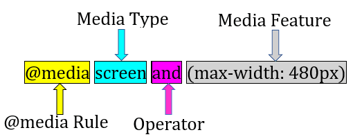
@media rule:
The first thing to do when setting up a media query in CSS is to declare what you intend to do. To do so, enter @media with no space in-between.
Media type:
The next element to follow the @media rule is the media type. It refers to the type of device for which you are setting up the query. Media types include:
all: This media type is suitable for all devices. If you do not use a specific media type like this: @media (max-width: 480px), ‘all’ will be implied.
Print: This media type is used when you intend to set up a media query for paged materials and documents in print preview mode.
Screen: This media type is used for screens. The CSS rules that follow will be applied to screens – mobile devices, tablets, desktops, etc. This is the most commonly used media type.
Speech: This is intended for screen readers.
Media Features:
Media features give more specific details. For instance, you can apply the style to screens that have a max-width of 600px (mobile devices). In this case, max-width is the media feature used for targeting mobile phones.
So here are a few media features and their functions:
- Height – This describes the viewport height
- Max-height – This refers to the maximum height of the browser window
- Width – Width of the viewport
- Max-width – This media feature defines the maximum width of a browser window
- Min-height – This defines the minimum height of the browser window
- Orientation – This refers to the orientation of the viewport.
To clarify, each media feature expression must be placed within brackets.
Logical Operators
When composing complex media queries, you’ll need logical operators such as: not, and, and only. You may also join more than one media query by using a comma.
and: The ‘and’ operator combines 2 or more media features to form a single media query. It is also used to join media types with media features.
not: The ‘not’ logical operator negates a media query. When using the not operator, a media type must be specified.
only: This operator helps to prevent older browsers from interpreting the media query wrongly. When you do not use ‘only’, media queries may not work well on older browsers.
They may interpret the ‘screen and (max-width: 767px)’ as ‘screen’, thereby applying the query to all screens. Note that this operator has no effect on modern browsers. When using the ‘only’ operator, a media type must also be specified.
, (comma): Commas are used to combine 2 or more media queries into one rule. This means when several queries are separated with a comma, each one is handled separately from the other. So, if one query in the list is true, the whole media query remains true.
Typical Example of a Media Query
If you are still wondering what a media query looks like, you can see a lot of them in the style.css file of a responsive WordPress theme. They begin with @media and are usually located at the bottom of the style sheets.
This is because the rules at the bottom of a stylesheet will overwrite the rules at the top (except you use the !important tag to prevent that from happening). Here’s a sample:
@media only screen and (max-width: 600px) {
body {
background-color: green;
}
}
In the example above, the query already sets a condition that clearly states ‘change the background color of the <body> element to green when the screen size is 600px or less.
So, even if your background color was initially set to ‘white’, the design changes to ‘green’ for mobile devices because of the media query. So ‘600px’ is the break point where your design element will behave differently.
Here is another example:
@media screen and (max-width: 850px) {
.column {
width: 50%;
}
}
@media screen and (max-width: 600px) {
.column {
width: 100%;
}
}
The first media query tells the browser to make column width 50% of the browser or container window when the screen 850px and below.
The second media query further instructs the browser to set the column width to 100% when the screen width is 600px and below. The next section explains what to do when the media query is not working.
How To Fix Media Queries Not Working
It is possible to run into errors while working with media queries. Sometimes, however, the media queries may not work at all, at other times they may not work on mobile devices or desktops.
So, after setting up your media queries and they do not work, do the following:
Ensure it is rightly positioned
Sometimes, your media query does not work because it is wrongly positioned.
Ideally, media queries should be placed at the end of the stylesheet. As you know, browsers read stylesheets from top to bottom. So, codes at the end of a stylesheet override declarations made at the beginning (except when !important is used to force the implementation of a code).
Also, media queries for smaller queries should be placed before larger screens. See the following lines:
body {
background-color: grey;
}
@media screen and (min-width: 480px) {
body {
background-color: green;
}
}
@media screen and (min-width: 850px) {
body {
background-color: lightblue;
text-align: centre;
}
}
The first rule sets the page background color to grey if it is less than 480px. The media queries then set the background to green – for screens between 480-849px, and sets the background color to light blue while also center aligning the text – for screens of 850px and more.
CSS declared inline
This may be the reason why your media queries aren’t working. That is to say, you may have declared CSS within your HTML document. So if this is the case, simply go through the HTML document and remove the CSS declared inline.
Alternatively, you can override the inline CSS with !important. As a result, this may solve the ‘CSS media query not working’ problem.
So let’s say that you are trying to change the text color for paragraphs in mobile devices to black with these lines of CSS.
@media screen and (max-width: 1024px){
p{
color: black;
}
}
But this isn’t working, likely because of an inline style applied for the same element. Therefore, you can add !important to this rule so it overrides the inline style as follows:
@media screen and (max-width: 1024px){
p{
color: black !important;
}
}
So, this should fix your media query issue.
An earlier declaration has the !important attached to it
As we saw above, !important can override other styles, even inline styles set for an element. If you have also used !important earlier in your spreadsheet for an element, media queries declared after that won’t work.
So, the easiest thing to do is to search for and remove it to get your media queries working.
Media Query Not Working on Desktop
Ideally, your media queries should work on mobile devices as well as on desktop computers. But, if they do not work on desktops, use max-width instead of max-device-width as your media feature. So, here’s the difference between the two.
Max-device-width: This refers to the actual screen-size of a device.
Max Width: This refers to the size of a device’s display area (the browser window).
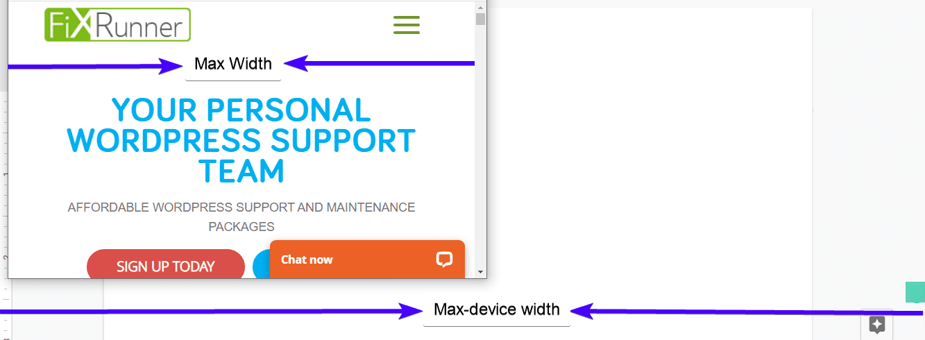
So, let’s say the max-device-width is set at 600px. It won’t work on a desktop device (even if you reduce the browser window to 600px) because the display size of the device is more than 600px.
However, if you use max-width, you’ll get a better result since it defines the browser display area and not the entire screen size of the device.
Media Query Not Working on Mobile Devices
If media queries work on desktop and not on mobile devices, then you most likely haven’t set the viewport and default zoom.
To do this, add either of the following lines of code to your site’s header, within the <head> </head> element:
<meta name="viewport" content="width=device-width, initial-scale=1"/>
Or
<meta name="viewport" content="width=device-width, initial-scale=1.0"/>
Note: You only need to add one of the code lines above, and usually, the first one does the job.
The width property defines the viewport size and is set to device-width, which tells the browser to render the website just as wide as it is naturally.
The initial-scale property defines the zoom level when a user first loads the page.
Frequently Asked Questions
What is a media query?
A media query is a technique used in web design that allows the webpage to adapt its layout and styling based on the user’s device or screen size. It allows you to specify different styles for different devices.
Why is my media query not working in WordPress?
There could be several reasons why your media query is not working in WordPress. One of the most common reasons is that you may have made a mistake in the syntax of your CSS. Additionally, your media query may not be targeting the correct element or may be overridden by other styles.
How can I check if my media query is working?
You can check if your media query is working by inspecting your website’s CSS using your browser’s developer tools. In the Styles tab, you should see the styles being applied to the element in question.
How do I fix a media query that is not working in WordPress?
To fix a media query that is not working in WordPress, you can start by checking the syntax of your CSS to make sure it is correct. You can also check that your media query is targeting the correct element and that it is not being overridden by other styles. Another option is to use a plugin like WP Add Custom CSS or Simple Custom CSS to add your media query to your website.
How do I add a media query in WordPress?
To add a media query in WordPress, you will need to modify your website’s CSS. You can do this by either editing your theme’s CSS file directly or by using a plugin like WP Add Custom CSS or Simple Custom CSS. Within your CSS, you can add a media query using the @media rule followed by the device or screen size you want to target.
What are some common media query sizes for responsive web design?
Some common media query sizes for responsive web design include:
- 320px (small smartphones)
- 480px (larger smartphones)
- 768px (tablets)
- 992px (small desktops)
- 1200px (larger desktops)
Can I use media queries with WordPress plugins and widgets?
Yes, you can use media queries with WordPress plugins and widgets. However, you will need to target the specific plugin or widget’s CSS class or ID to apply the styles correctly.
Conclusion
With the rapid rise in the number of mobile web users, site owners must take responsive design seriously. We already mentioned that one of the ways of making your web page mobile-friendly and responsive is by using a media query.
Media queries are also quite easy to set up. However, if you need further help, contact us or leave a comment below.

